
Visualization 02: Burtin’s Data
Burtin’s Antibiotic Data Visualized
This project leverages Tableau to communicate a classic data visualization project. There are countless examples of this project online, but this was my take on the problem. I follow the grammar of graphics and double down on text annotations to convey insights. My rational is included below.
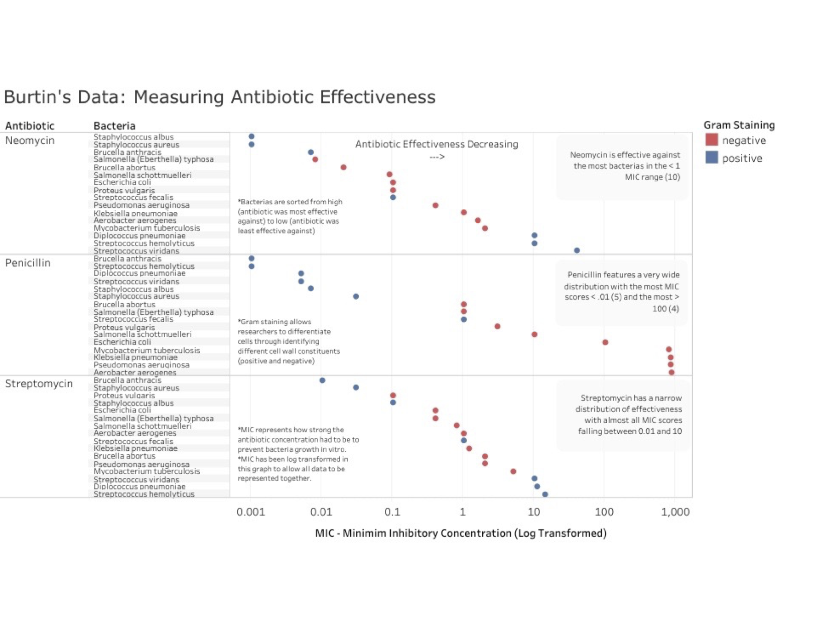
Communication Goals of Visualization In my visualization, I attempt to communicate each of the three antibiotics’ effectiveness in fighting the different bacteria strains. I thought it was important to attempt to highlight what bacterium each drug was most effective in fighting. I also thought it was important to allow the viewer to be able to see the drug’s effectiveness against all bacterium. My overall goal was to present all of Burtin’s data in a way that allows the viewer to make judgements about which drug they believe is both overall most effective, and most effective in certain cases against specific bacteria.
Design Rational My design shifted and morphed as I spent more and more time working with the data. As I worked, my belief grew that the most important aspect of the data was the comparison of each drug to one another. I first thought that in order to address this, I should plot each drug’s effectiveness per bacteria which resulted in a messy scatterplot. I ultimately decided to move away from this and separate the three antibiotics to demonstrate their overall characteristics. In order to allow the viewer to see these differences, I encoded the antibiotics each with their own set of x channels which were taken up by the bacteria. In the y channel, I performed a log transformation to address the vast distribution in MIC scores and then plotted the MIC scores with circle marks. I tried bars but didn’t like how it took up so much of the space of the visualization.
I stacked each of these graphs on top of one another to represent drug effectiveness in a side-by-side comparison. Finally, I added text annotations throughout the graph. On the left side of the graphs I included important information regarding the graph itself, things that will help the viewer interpret the data. On the right side of the visualization, I included info about the plots; things I believed were key takeaways. I structured the order as it is natural for people to read left to right in the United States, which hopefully allows the viewer the opportunity to make their own judgement prior to reading my comment on the right side of the visualization. I included a header annotation at the top of the page to represent that drug effectiveness is decreasing as you read to the right, a somewhat counterintuitive approach. I tried different MIC distribution approaches but didn’t like any of them and ultimately settled on sorting by bacteria effectiveness so the distribution would trend from high with most effective to low with least effective, a somewhat natural progression despite the odd effect of having the drug weaken to the right. I also added the gram staining in the color channel. Despite not thinking it was very important, I thought it was important to represent as much of Burtin’s data as possible, thus I left it in this visualization. This became important because we can see a pattern emerge in penicillin’s gram staining which proves to be important. Through doing all this, I was able to craft a visualization that I believe not only communicates each drug’s overall effectiveness in fighting bacterium, but also allows the viewer to judge each drug against one another.